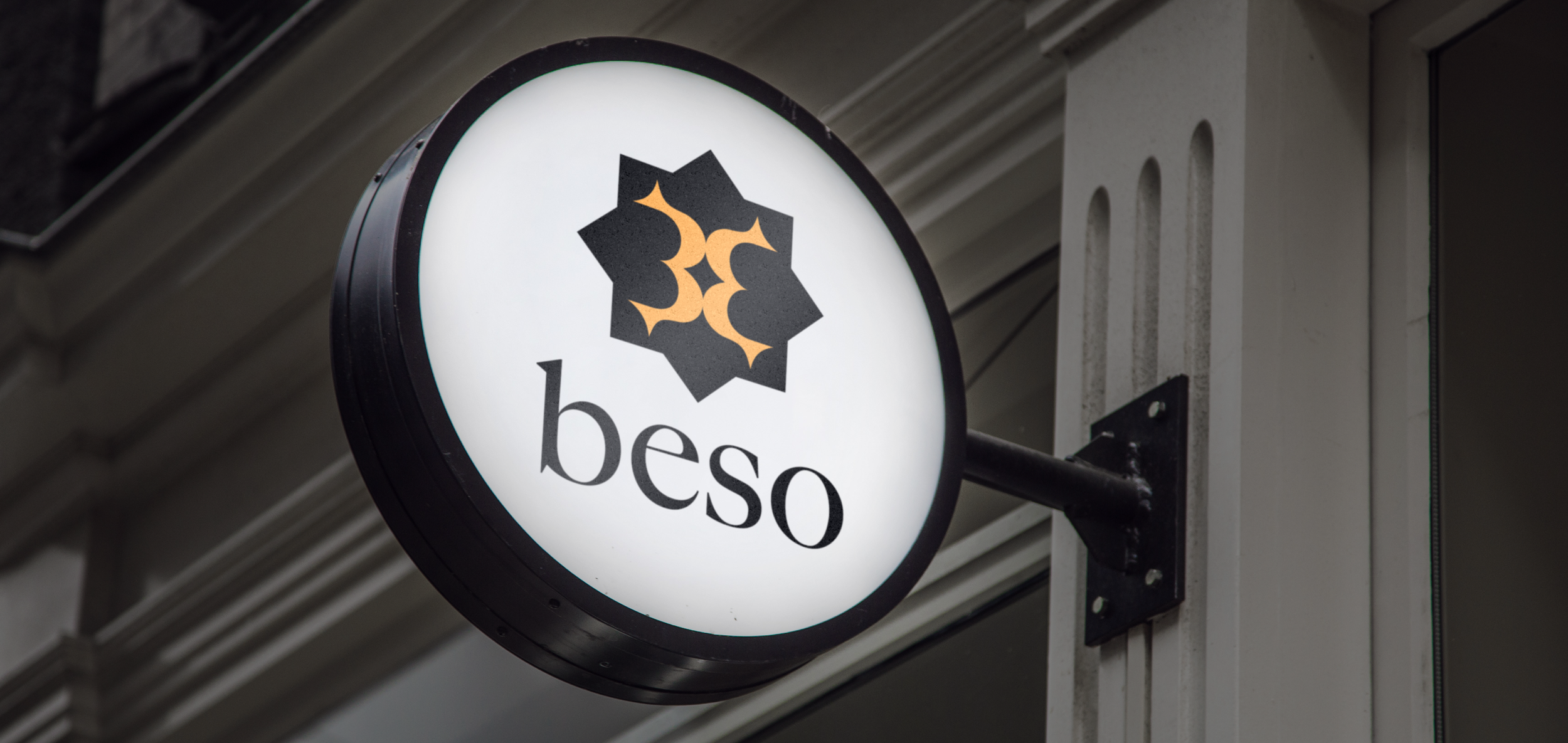
Beso
I created the logo and designed the business cards, menus and signage for a restaurant located in the heart of Central. Because Beso means “kiss” in Spanish, the logo was built around two abstract lip shapes coming together, giving the brand a warm, inviting personality from the outset. With the location in mind, I kept the overall identity clean and minimalist to appeal to the local crowd and create a welcoming atmosphere for customers in the area.
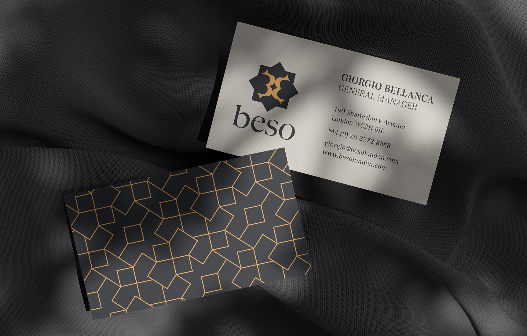
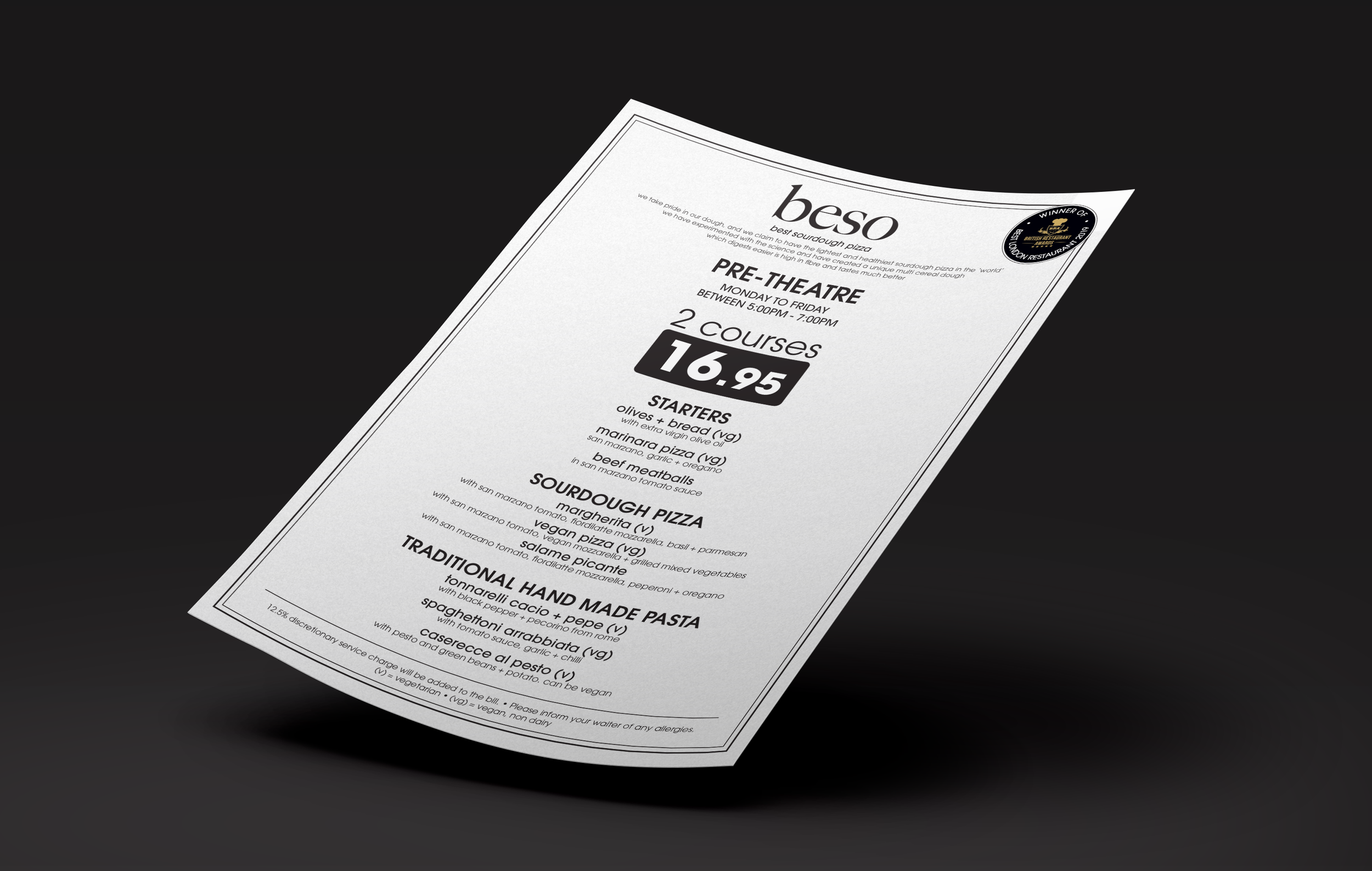
I focused on choosing the right colours, designing a pattern for the business cards, and keeping the overall approach simple but effective so everything felt visually pleasing. I spent time making sure the palette, pattern and typography worked well together, so the brand felt consistent and had a bit of personality without overcomplicating anything.